

Products in this catalogue
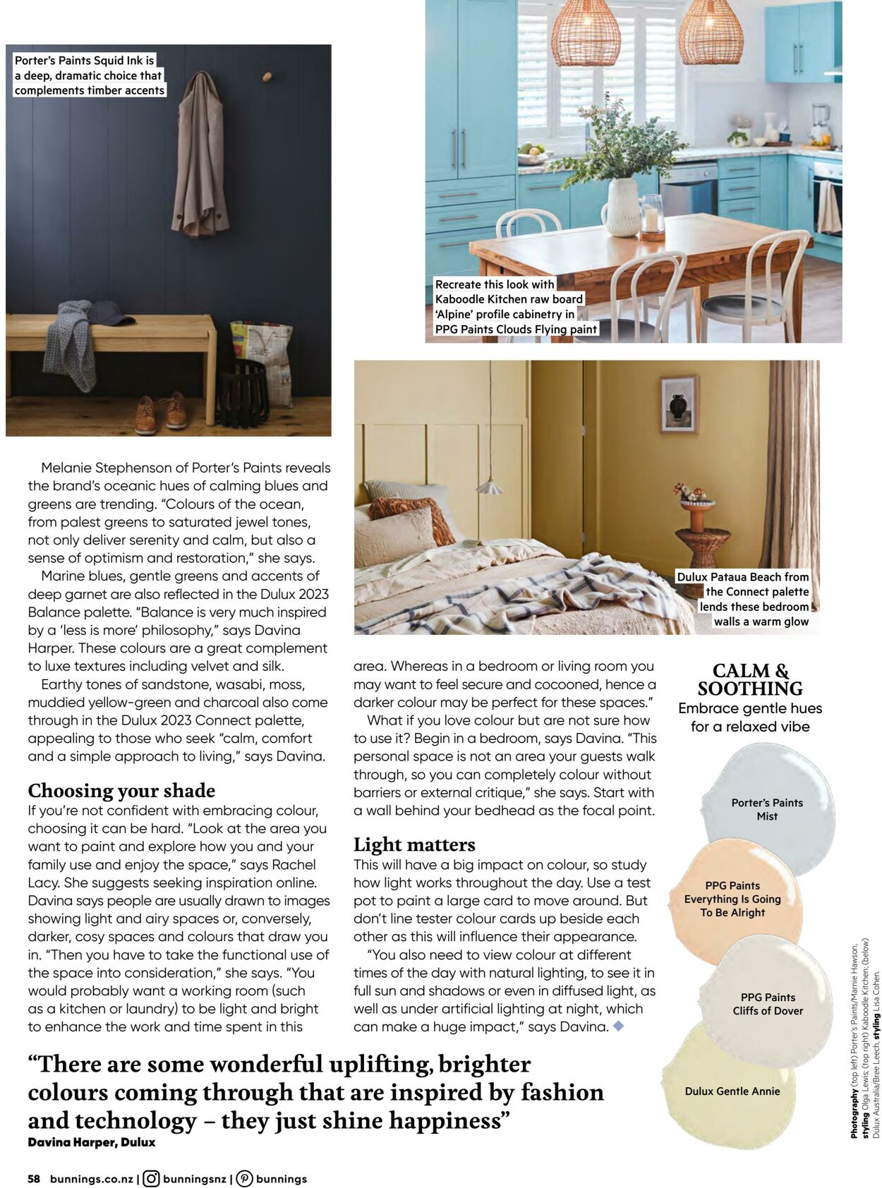
Porter’s Paints Squid Ink is a deep, dramatic choice that complements timber accents Melanie Stephenson of Porter's Paints reveals the brand's oceanic hues of calming blues and greens are trending. “Colours of the ocean, from palest greens to saturated jewel tones, not only deliver serenity and calm, but also a sense of optimism and restoration,” she says. Marine blues, gentle greens and accents of deep garnet are also reflected in the Dulux 2023 Balance palette. “Balance is very much inspired by a ‘less is more’ philosophy,” says Davina Harper. These colours are a great complement to luxe textures including velvet and silk. Earthy tones of sandstone, wasabi, moss, muddied yellow-green and charcoal also come through in the Dulux 2023 Connect palette, appealing to those who seek “calm, comfort and a simple approach to living," says Davina. Choosing your shade If you're not confident with embracing colour, choosing it can be hard. “Look at the area you want to paint and explore how you and your family use and enjoy the space,” says Rachel Lacy. She suggests seeking inspiration online. Davina says people are usually drawn to images showing light and airy spaces or, conversely, darker, cosy spaces and colours that draw you in. “Then you have to take the functional use of the space into consideration,” she says. “You would probably want a working room (such as a kitchen or laundry) to be light and bright to enhance the work and time spent in this Kaboodle Kitchen raw board ‘Alpine’ profile cabin‘ feos this look with PG Paints Clouds FI = I a ibe area. Whereas in a bedroom or living room you may want to feel secure and cocooned, hence a darker colour may be perfect for these spaces." What if you love colour but are not sure how to use it? Begin in a bedroom, says Davina. "This personal space is not an area your guests walk through, so you can completely colour without barriers or external critique,” she says. Start with a wall behind your bedhead as the focal point. Light matters This will have a big impact on colour, so study how light works throughout the day. Use a test pot to paint a large card to move around. But don't line tester colour cards up beside each other as this will influence their appearance. “You also need to view colour at different times of the day with natural lighting, to see it in full sun and shadows or even in diffused light, as well as under artificial lighting at night, which can make a huge impact,” says Davina. “There are some wonderful uplifting, brighter colours coming through that are inspired by fashion and technology - they just shine happiness” 58 bunnings.co.nz | (O) bunningsnz | (P) bunnings “lends these bedroom walls a warm glow CALM & SOOTHING Embrace gentle hues for a relaxed vibe Porter's Paints Mist PPG Paints Everything Is Going To Be Alright PPG Paints Cliffs of Dover Dulux Gentle Annie
| Name | Details |
|---|