The query has to be between 2 and 50 characters


Products in this catalogue
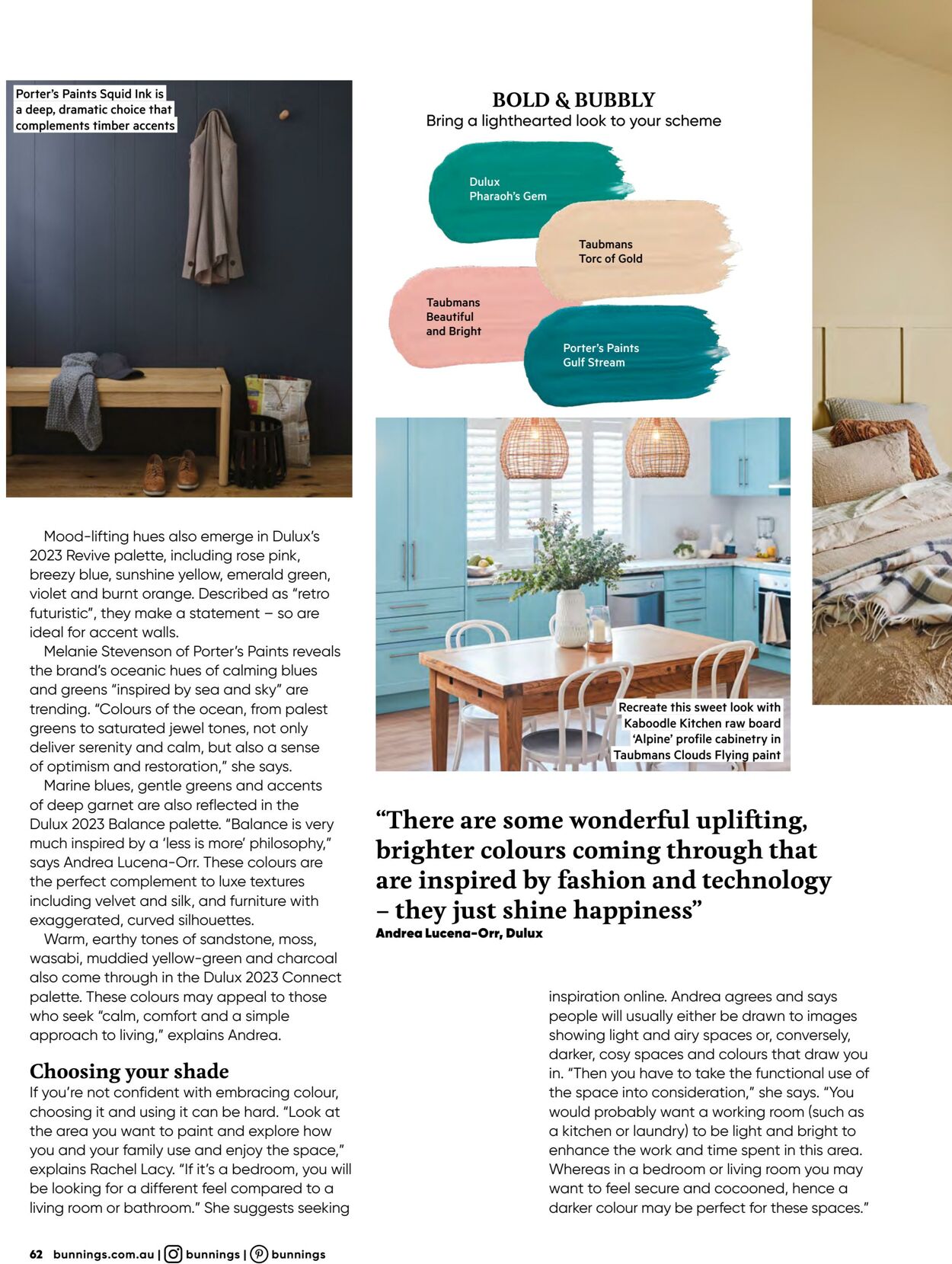
a deep, dramatic choice that complements timber accents Mood-lifting hues also emerge in Dulux’s 2023 Revive palette, including rose pink, breezy blue, sunshine yellow, emerald green, violet and burnt orange. Described as “retro futuristic", they make a statement - so are ideal for accent walls. Melanie Stevenson of Porter's Paints reveals the brand's oceanic hues of calming blues and greens “inspired by sea and sky” are trending. “Colours of the ocean, from palest greens to saturated jewel tones, not only deliver serenity and calm, but also a sense of optimism and restoration,” she says. Marine blues, gentle greens and accents of deep garnet are also reflected in the Dulux 2023 Balance palette. “Balance is very much inspired by a ‘less is more’ philosophy,” says Andrea Lucena-Orr. These colours are the perfect complement to luxe textures including velvet and silk, and furniture with exaggerated, curved silhouettes. Warm, earthy tones of sandstone, moss, wasabi, muddied yellow-green and charcoal also come through in the Dulux 2023 Connect palette. These colours may appeal to those who seek “calm, comfort and a simple approach to living,” explains Andrea. Choosing your shade If you're not confident with embracing colour, choosing it and using it can be hard. “Look at the area you want to paint and explore how you and your family use and enjoy the space,” explains Rachel Lacy. "If it’s a bedroom, you will be looking for a different feel compared to a living room or bathroom.” She suggests seeking 62 bunnings.com.au | (G) bunnings | P) bunnings BOLD & BUBBLY Bring a lighthearted look to your scheme Dulux eel) Taubmans Torc of Gold Taubmans Beautiful ce * Kaboodle Kitchen raw board | ‘Alpine’ profile cabinetry in ff (Taubmans Clouds Flying paint \r s uM “There are some wonderful uplifting, brighter colours coming through that are inspired by fashion and technology — they just shine happiness” Andrea Lucena-Orr, Dulux inspiration online. Andrea agrees and says people will usually either be drawn to images showing light and airy spaces or, conversely, darker, cosy spaces and colours that draw you in. “Then you have to take the functional use of the space into consideration,” she says. “You would probably want a working room (such as a kitchen or laundry) to be light and bright to enhance the work and time spent in this area. Whereas in a bedroom or living room you may want to feel secure and cocooned, hence a darker colour may be perfect for these spaces.”


| Name | Details |
|---|
