The query has to be between 2 and 50 characters


Products in this catalogue
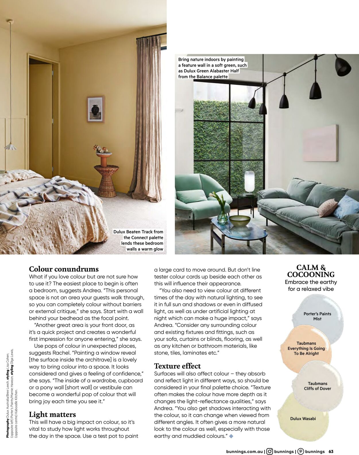
Photography Dulux Australia/Bree Leech, styling Lisa Cohen: Copposite centre) Kaboodle Kitchen Colour conundrums What if you love colour but are not sure how to use it? The easiest place to begin is often a bedroom, suggests Andrea. “This personal space is not an area your guests walk through, so you can completely colour without barriers or external critique,” she says. Start with a wall behind your bedhead as the focal point. “Another great area is your front door, as it's a quick project and creates a wonderful first impression for anyone entering,” she says. Use pops of colour in unexpected places, suggests Rachel. “Painting a window reveal [the surface inside the architrave] is a lovely way to bring colour into a space. It looks considered and gives a feeling of confidence," she says. “The inside of a wardrobe, cupboard or a pony wall [short wall] or vestibule can become a wonderful pop of colour that will bring joy each time you see it.” Light matters This will have a big impact on colour, so it’s vital to study how light works throughout the day in the space. Use a test pot to paint Dulux Beaten Track from the Connect palette lends these bedroom walls a warm glow Bring nature indoors by painting a feature wall in a soft green, such as Dulux Green Alabaster Half from the Balance palette a large card to move around. But don't line tester colour cards up beside each other as this will influence their appearance. “You also need to view colour at different times of the day with natural lighting, to see it in full sun and shadows or even in diffused light, as well as under artificial lighting at night which can make a huge impact,” says Andrea. “Consider any surrounding colour and existing fixtures and fittings, such as your sofa, curtains or blinds, flooring, as well as any kitchen or bathroom materials, like stone, tiles, laminates etc.” Texture effect Surfaces will also affect colour — they absorb and reflect light in different ways, so should be considered in your final palette choice. “Texture often makes the colour have more depth as it changes the light-reflectance qualities,” says Andrea. “You also get shadows interacting with the colour, so it can change when viewed from different angles. It often gives a more natural look to the colour as well, especially with those earthy and muddied colours.” @ CALM & COCOONING Embrace the earthy for a relaxed vibe Porter's Paints Mist Taubmans Everything Is Going To Be Alright Taubmans Cliffs of Dover Dulux Wasabi bunnings.com.au |(@) bunnings |) bunnings 63


| Name | Details |
|---|